Sunday, 22 November 2015

End of Unit Evaluation

Starting Point Photo 


Looking back over the unit of 'Intentions', I feel like I have really developed my practice, specialising in knit. I have found it overall very exciting. I have really enjoyed my starting point using mostly Acrylic and watercolours to capture the beautiful landscapes of my holidays over the summer. And then using my knowledge on the domestic knitting machines and new learnt techniques on the Dubied to translate these into knit. Working with the context I chose allowed me to be very experimental, and really push myself to doing things I had never done before, this involved working in a more sculptural/ three dimensional way.


Development Photo


Development into Drawing

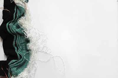
Knit I feel worked very well for my context of sculptural fashion as it allowed me to successfully produced detailed textured samples, that I can envisage as a fashion garment. The way I captured condense ripples with blocks of bold colours I feel is very striking and could be on the runway. I feel that I had planned out my samples well when it came to refining my ideas, this meant that I used my time efficiently.

Final Sample


I have found that during the unit, learning the new techniques on the dubied is what has worked most successfully. I feel that I have picked it up very easily and quickly and am kean to learn more and get much better on them.  I also have discovered that I have found it a little easier to translate my drawing into knit this unit, though am still not a completely confident, I have myself felt an improvement. For example, in my knit samples I have focused my work on the theme of capturing movement, so my drawings turned more abstract  than literally drawing what I saw. This then helped me to think of ways that I can move these drawings into knit. As they were more about a quality than an object. I then started to play around with form, using materials like bin liner, so that I could see exactly the shape and textured that I wanted to achieve on the machines.


Final Sample


There has been many hurdles during these few weeks which I have had to overcome, something that I found did not work so well is my context. Though During the unit I have done a lot of research.  My research has been towards installations. As the unit has unravelled it seems that my knit samples have not developed enough in the direction of creating something suitable for a space, though if I had more time this may be more visible, but as the unit did not last too long, it was not so clear. So this forced me to look more into fashion as a context, and feel that this works very well. My knit samples are very three dimensional and textured which I feel fits well in the fashion world, as a catwalk garment.

If I had time to continue with this project, I would love to see it go larger, and see how the linear marks within my work really become movements. and I would like to experiment more with manipulating the shape of the knit. causing more three dimensional shape.


Thursday, 19 November 2015

Final Week


Painting from Visual Research


During the final week it is really about bringing my samples together to make them look like a complete collection. This involved me looking at they all as a group, making sure nothing was missing, the colour balance was correct, that there was not too much of one colour or too little of another.


Final Samples with Foil


During the beginning of this unit I had used tin foil to capture the shimmer in water  synthetically. This I had moved into foiling, but had not really pushed it, though in these last few weeks had experimented with it on my knit samples, and found that it does in fact work very well and that this brings back that shimmer I was capturing at the beginning, and that was a main focus.


Final Sample with Foil 

Wednesday, 18 November 2015

Context


Punk: Chaos to couture

In today's tutorial, it was suggested that my collection of knit samples has a fashion element to them, and though I have been thinking and having a instillation theme in mind, I have always been making reference to fashion also, and now think that this is more suited. Though the knits have a fashion element, I will not let go of the three dimensional quality and enthusiasm. So the garment designs in mind for my samples will be very sculptural, creating movement on the body.

Here are to examples of catwalk designs that have captured my interest. They have caught my interest specifically because they are very over the top fashion, and not something that would be worn for everyday wear.

This I feel is were my knit samples could bee used, made larger scale and loosely hung on the body.


Sister to Sibling

Wednesday, 11 November 2015

Refining ideas

This week's tutorial was very helpful. As I have worked out what it is I am trying to achieve, I am finding that I am now refining my final ideas and techniques to get the best outcomes.

Final Sample


In this week's tutorial it was suggested that I focus a little more on the colours I am using, as within my drawings the colour has been very important and has been a lot of variety of blues gradually changing shades, to create depth. This I feel I can get more accurate within my knit, as I have done a lot of colour study this unit. I feel I can achieve this by carefully selecting yarns and using more shades, but colour even try dying my yarns, though this is a great idea I feel I do not have enough time to try this out this unit. Though a quicker way to achieve this would be to paint directly onto my knits, so this is something that I will try out.


Final Sample


During this week I will be continuing to experiment with ideas, but begin to pick out what is working well, like ripple, plating and push them forward by combining techniques. 


Wednesday, 4 November 2015

Refining Work Week 3


When doing some research I came across this piece, I was captured by this piece because of its form. This got me thinking of ways that I can get my flat samples to appear to have more form and three dimensional shape. I thought that this could be through adding wire into my samples afterwards, or even bedding wire into my knit samples or knitting with a yarn that will hold its shape.


Ann- Kirstin Abel TEXTILE FUTURES


In the below photo I have embedded wire into my knit sample, so that it enables me to when cast of, start to manipulate its shape and form.  This I feel is working very well, especially contrasting this with ripple on the domestic, as it makes to linear marks look as if they are swaying, though this is just the wire moving them.


Sample experimenting with wire in knit 


Close up of same technique


Refining Work Week 2

This week I have been getting used to using the Dubied Machine, I feel as though I am getting better at it the more I practice and am slowly finding ways to translate my images and drawings into knit. This week I have be using techniques like racking and ripple mostly to try and capture the waving movement in my drawings, and using ripple to add textures. Though feel that the hook up technique on the domestic machine is working well and would be good if I could combine the two, this could be achieved if I transfer the knit and swapped in to a different machine.


Capturing texture of water 


Transfer to knit


Also it was suggested that though I am trying to achieve an organic look within my work, it would be nice to show the more structured designs along side the organic ones. Though could do both these in one samples which I have found are qualities within my drawings, that there is a lot of texture and colour but then this fades out into pale colours and flat texture.


Refining Work

During this weeks Tutorial it was noticed that I had been experimenting with new ideas and had produced lots of images to work from, but as I had got a bit carried away with new ideas I needed to sit down and thoroughly look through what I have done and pick out what is working and what is not.

This I have done and have zoomed in on many pieces of work to see areas that can be achieved in knit. The imagine below I feel will look good in knit capturing the linear marks  with stripe/ ripple so subtle texture, then moving into more textures like hook up and different tensions and thickness's of yarns.


Close up of painting

Looking through my sketchbooks I saw some samples that I had created over the summer, were I had layered lots of fabrics for texture, this I feel was working well and could link this to my drawings as they hold a lot of textures, this I could even achieve by adding plastics onto my samples after, or adding other materials into the knit. 


Summer Sample


Sunday, 25 October 2015

Development week 2

I have been continuing to try an capture movement, through paintings, but have began thing to think more in a three dimensional way this week as what I create will be something that can be touched and move around, hopefully more interesting than a flat drawing. I have thought back to my brief and the themes as I have been getting a bit carried away with experimenting with new ideas. I chose the theme organic and synthetic, this idea of creating something very natural like water and waves, with something very unnatural like plastics. Thinking back to this made me think of how I can create natural three dimensional shapes with flat surface, so while experiment with this it has helped me to find the connection with my paintings and knit, using techniques like hooking up to create this layered look.


Layering unnatural materials


Something else that I experimented with that I did not find as helpful. I took a risk by first layering up lots of textures, fabric masking tape etc, them on top layered lots of colour to them print the colour onto itself, this tuned out just almost looking a mess, the idea and image behind it was not achieved at all. Though it does not look appealing this idea of playing around with fabric to create texture was helpful.


The unsuccessful layering 


Thursday, 22 October 2015

Development

During this weeks tutorial it was suggested that the technique I was trying out, using bubbles and ink, was working well, this idea of capturing something very unpredictable became noticed again. And also then contrasting something very natural and organic then with the linear marks that I have been working with. This idea of capturing something organic I really enjoyed, I then went one to take some photos to work from of ink in water, this I can work from and also take inspiration to transfer straight onto the knit machine


Capturing ink in water


I have struggled this week with moving my ideas forward, weather this is due to my need to go onto the knitting machines more and experiment with yarn qualities more or weather I need to get my ideas planned out before rushing into anything.

I am liking the linear drawings with bold colour I am using and also like the textured pieces I did at the start which I had tried to join together to create something smooth to then something more three dimensional. These techniques are the techniques that I wish to continue with most as I feel they have a lot of potential.

Thursday, 15 October 2015

Visual Research Week 2

During this week I have been continuing with the idea of movement, focusing a little  more on linear drawings to capture the way water flows. I feel using linear marks have helped me see movement more clearly as it looks more literally as your eyes follow the marks.

I have continued to use these linear marks with colour and materials such as plastic, tin foil and masking tape to create textures under the surface. This technique I feel works well and this certain piece I feel almost looks heavy were all the texture is based at the base of the image.


Linear with bold colour and texture 


Close up of above image 


I feel that within this piece the weight of the wave has been captured and would be even more emphasised with yarns such as contrasting heavy and light yarns.

It was suggested to me to use foiling instead of tinfoil as this would create a more pleasing look and less collage like. I am finding that it is indeed working nicer and am finding that is gives an unpredictable look. which is very suited, and works towards what I am trying to achieve as waves and water are very unpredictable and every changing.


Tin foil contrast with flat colour 


Close up of above


Thursday, 1 October 2015

Visual Research Week 1

During this week continuing with Visual research, I am hoping to create a full body of work, water being my over all theme but looking at the properties of water rather than it so literally. So thinking about how movement for example can be captured through different media and how I draw. I had started working with watercolour mostly but have found that this media is to light and soft for what I am trying to achieve, so moving onto acrylic is working better, also layering up texture before painting over to is creating something very interesting.


I am finding it tricky to get across what I want to achieve, due to the media and scale I am working on and think that working on sheets will work better and allow me to work more freely and expressive. Though my sketchbook is allowing me to try out things smaller to see what is working.


Dana Barnes

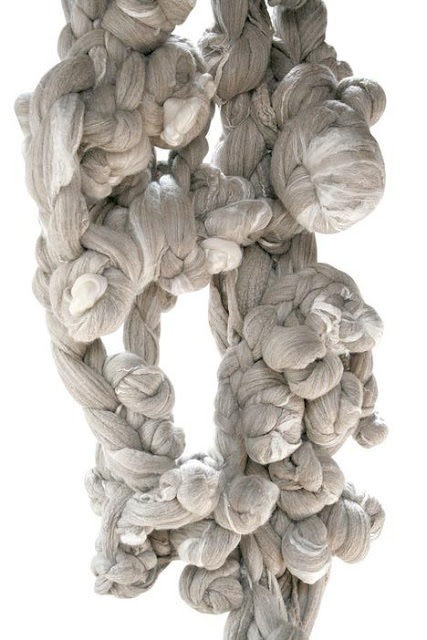
I have been looking at artist Dana Barnes who works with unspun natural fibres, who uses techniques like knotting and twisting to create large scale textiles for interior spaces. I find here work rather interesting because I feel that it captures a quality of stress, due to it being all tangles together, and this quality I feel is something I want to achieve and due to its scales it is even more powerful.


Tuesday, 22 September 2015

L5 Inspirations

During the first group critique back from summer. Discussing each others work I found was very exciting to see what everyone had chosen to start with and also very useful in terms of being able to continue with new ideas.


Acrylic of St Ives


Other students during the critique suggested to establish a colour pallet, though there is one continuing through my work, just to really pull out colours from my imagery. As some of the colours of really beautiful and rich. It was also suggested to continue doing more paintings in the style I have using Acrylic, though shall do that but will also try this style with Goache to see how that works too.


Watercolour of Rivington

Layered fabric on above 


What I found most useful was that they noticed that to translate these paintings into Knit it may be difficult as they aren't very textured, so to make a start on getting my mind into knit, I feel I need to capture some textured quality from my paintings and imagery, so that this process will become easier and more affective. This I think will be really interesting as there is a lot of textures in my imagery and paintings that with a view finder could work really nicely. I am thinking that my work will good in knit as I will be able to create big chunky constructions with knit to recreate the wave affect. I feel that the style I want to achieve will look best slightly larger, as artists that I have been researching have all be work on large scale for example paintings being bigger brush strokes.


Layers of plastics and fabrics 

Close up of above 


An example of what I was told was working well was the acrylic paintings and recently had started trying to recreate some textures a little more three dimensional using plastics and layer up materials. This other students had said was working well and had potential. I was experimenting with this idea as I'm wanting to create very textural work for this topic as focusing on water/ waves etc.


Thursday, 6 August 2015

L5 summer

L5


Erin Fitzhugh Gregory

During my research over the summer, I have found myself being interested in documenting what I see as a whole landscape as oppose to restricting myself starting with objects.  I have always wanted to practice the skill of painting landscapes and feel this is the ideal opportunity with going on holidays and seeing some beautiful places. These two artist I have posted are two different style though similar in some ways, like the thick strokes of colour, though one obviously bolder. This style I have always enjoyed so have been painting a few landscapes of my own like this, trying to capture the colours as accurately as possible.


Susan Schiesser

As I have been painting in this style I feel as though it may look even more exciting on a larger scale, closer to the amazement of the large sea.

During my holiday in Cornwall, looking at the sea is amazing and all the colours of the water. This is something that I think could be captured beautifully. Also whiles looking around in many galleries their, there was many different styles of paintings all of the beaches and seas, all interpreted in different ways.

Sunday, 3 May 2015

Unit X Post 3

Wires from Blackpool Illuminations 

When creating my samples for weave I wanted to create something very bold and with block colours. Then I came across artist Wayne Thiebaud, who inspired me with his bright and colourful painting. Within his paintings you can extract stripe qualities, I find that this work fits well within my own work, so concluded that painting or interpreting things in this style has been very useful.


Wayne Thiebaud

Below illustrates the way in which I cut my photos into stripes and organised them to make patterns, I feel that doing this was very useful, as it created a vivid image in my head of how I could translate my photos into patterns within my weave.

During the many weeks of unit x, weave as a group have had many tutorials and critiques, to help us look at our work and see what is working well and not so well for everyone. I really feel that these have been useful, I think that sometimes within my work and I can get caught up in what I am doing, and ignore some of the elements that have been working well at the beginning. Therefore these tutorials and critiques help me to look at my work as a whole, and see what links I can make from the start of the unit to were I am currently working.

Striped Photos 


During this unit I came across a hurdle, as I was not achieving the look that I was hoping for, so I took a trip to Maplins and purchased some thick bold wires, finding that when I brought these into my work I was gaining the bold statement that I had hoped for. Though when I started to do this, I soon realised that my work and techniques were looking very similar to Artist Designer Elizabeth Ashdown, with the hooped thick threads though my weft. So to move away from this, I brought back in some of the old techniques that I had used on my older samples, which captured the marks and textures from my photos from Blackpool, such as the 'warp rib' technique, capturing the circular marks within my photos of light bulbs. Bringing these techniques into my work, rather than getting carried away with what looks pleasing to the eye, brought the meaning and everything from the start of the unit back to the final samples. 


A Final Weave Sample

During Unit X, I believe that I have gained a good understanding and knowledge of weaving. I have enjoyed the unit overall, though I feel that my starting point was not amazing, and focusing on wires did not really give me a good bases to collect drawn research from, so I could of done with looking at everything from a different perspective, such as drawing in a larger scale and cutting the detail marks from these. I really enjoyed my chosen colour scheme, as I think it is very bold and vibrant, I found this very fun to work with. 

If I was to start this brief again, I would  go out and collect more research, as I really feel like this is what has let me down. I still have many ideas to continue this topic on,  and have lots of things to experiment with when weaving. For example,  even thicker wires and bolder colours in my pallet, I also think it would be interesting to make my own wire by adding thread to them on the sewing machine. This would make the wires themselves more colourful and interesting,  rather than them being just a single plain colour. I think this technique for me has a lot of potential, which I feel very positive about.

A Final Weave sample

Due to the fresh look of my samples, I feel that they would be best suited for interior, preferably in a kitchen, as they are very clean and vibrant looking. The samples I have created, I do not feel, shout out a particular area of context, though if in the right use could be used as fashion, or perhaps fashion accessories and garment edging.


Unit X Post 2


After being many places and gathering research to start my project, I first started to create my colour palette, I find this helpful as a starting point, and at this time we were starting to think about warp designs, so thinking of a colour scheme was a good idea as this helped me in the decision process. 

Colour Pallet  


The quality that really enticed me to this area was the chaos which was of all the wires tangled together, but yet the order in the block colours of the cords themselves. I found it very hard to translate my photos into drawings focusing on texture, and then to translate this to weave, but did what I could and found that actually slicing up the photos into strips really helped, and taking the qualities directly out and onto the loom. I felt that I did really struggle with the drawing in my sketchbook but found it easier drawing with the weaving. 

Wires from Blackpool Illuminations 

I really liked the order within my work, and this structure came through in my drawings too. I had started weaving and leaving strands as I liked the effect of this and it reminded me of typical passementerie, but this is not what my work was about, so I moved away from this and thought a more controlled and considered edge said more about my work and style. I thought of having tassels but cut very sharp and straight, however when playing around with ideas I found that I much preferred having a continuous pattern running through my weave and having the wires appearing through, creating something lovely outside the weave, a continuous pattern.

I wanted to capture the chaotic nature of the piles of wire through my choice of yarns, so using a flat and slightly shimmery yarns, and incorporating wires in my own work. I have been using these methods, but have not been seeing the results I had hoped for. My samples are more toned down than they should be, and the wires seemed to be too thin and fragile for what I was tying to achieve. Also a few of my samples were looking too similar to tea towels, due to the lack of stability in them and the softness of the yarns. So I needed to get thicker wires, and some bolder, more vibrant yarns, and avoid the typical checks. 


Lights within the illuminations

Simple translation for weaving the pattern

Here I am showing how I have continued to translate the research I had gathered at the beginning of the project, these sorts of  marks I have brought into my weaving create very structured pieces, taking into consideration the linear marks both vertical and horizontal.


Warp Decision Making

When deciding on what warp to make, I wanted to go with colours that were within my colour pallet, these were all mostly vibrant colours, but I wanted to achieve a less saturated look, so I selected more toned down versions of my original colours. This meant that I could experiment with brighter colours in my weft, and not be overwhelmed by the brightness of the warp. So far with my weaving it has been successful, but I am certainly finding out what I like the look of and what I do not. I am finding the method very time consuming as I have been used of knitting, and find that with knitting you can produce samples very quickly, but with weaving, not so much. This is good as it means planning out what you are going to do next is more important, as it is going to take time, but I am finding that if something is not going well, I am not fast enough at it that I can get enough samples done, and refine them.


Wednesday, 29 April 2015

Unit X Whitworth


When visiting the Whitworth gallery in Manchester, we was to focus on the portrait exhibition and focus on textures. I thought there was many different variations of mark making, some more effective than others. I particularly like the painting below and the marks were very expressive and dramatic, but from a distance this all fades away and looks very smooth. 


Though I did love the more talented detailed pieces, this painting below really caught my eye, The bold shaped and bright colours. this I realised was a quality that I wanted within my own work, Bright and vibrant that catches eyes. 


From the Whitworth gallery I documented the marks made within the art there and have used it within my own work. 


Monday, 30 March 2015

Unit X Week 1

Blackpool Beach


During the first week of Unit X we have been set to go to archives. Tuesday we took a trip to Blackpool and visited the sea front, the big disco ball sculpture and the illuminations centre where the illumination sculptures were designed and made. Out of this trip I did not really have a good idea about what to actually focus my work of, but was most interested in the wires at the illuminations, I was fascinated by how hectic the wires were and how many bundles of them there was, all very colourful and all tangles together.


Silk Museum


Also during this week we had the opportunity to visit the Macclesfield silk museum. This was really interesting, fascinating seeing a mill as it was when it was in use. I thought it was good to see how big the machines where and how much they have changed today. It also helped me to understand weave a little more as when we went to look their, I had not actually done any weaving yet. 


Wires from Blackpool Illuminations 


As the wires mostly interested me from the illuminations, I am going along with the bright flat colours similar to these, so thought as I can not get amazing drawings from these, I could look at other things relating to the bright colourfulness of Blackpool like the sweets and tack.